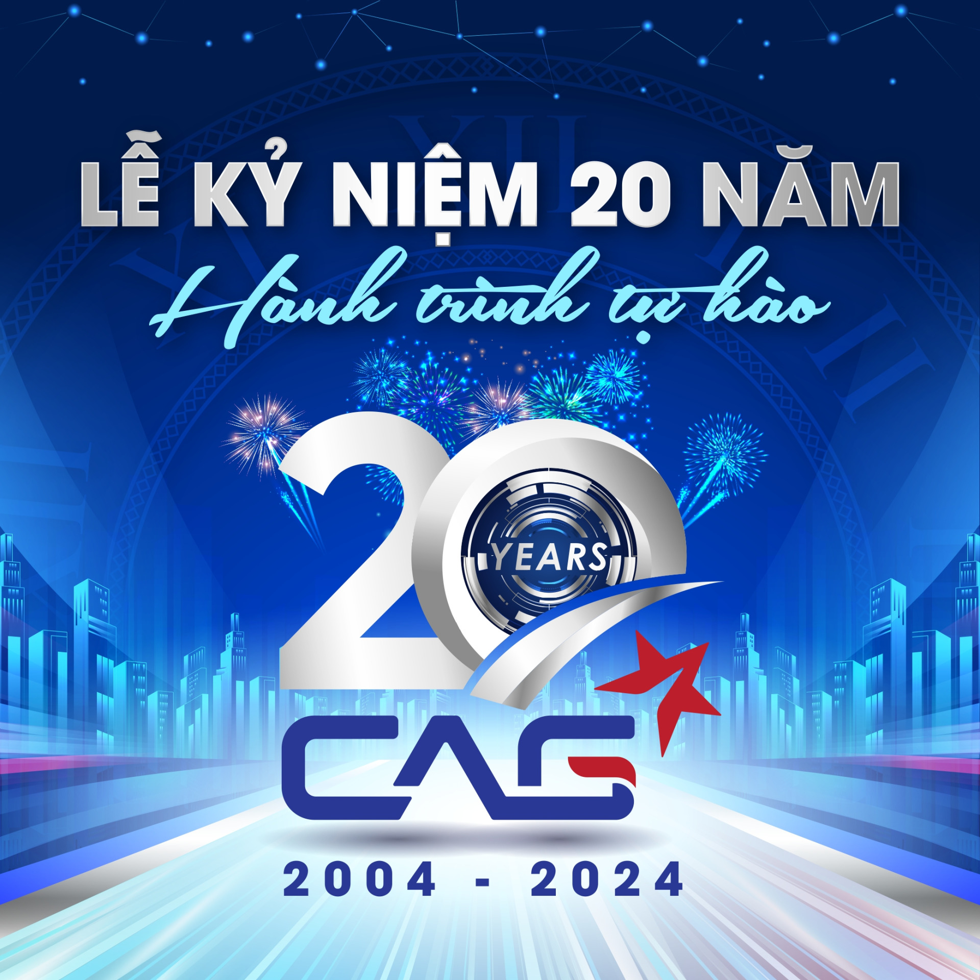
CAG Rebrands With A New Logo Design
CAG’s 20-year journey has reached a pivotal moment, poised for a breakthrough that aligns with its new goals and development strategies. The company’s vision is to become a diversified corporation that prioritizes sustainable development for everyone today and for future generations.
![]()
CAG’s new logo features a more modern and creative look, affirming the company’s strong commitment to transformation in the upcoming phase. The logo’s design evolved from the letters “CAG” (the company’s name) combined with a dual symbol: a five-pointed star representing eternity and an upward-pointing arrow signifying the brand’s continuous and sustainable growth. This also reflects CAG’s transition from an aluminum and glass facade contractor to a diversified company.
![]()
A notable breakthrough in the new logo is the stylized leaf within the letter “G,” which highlights CAG’s commitment to GREEN & SUSTAINABLE development across all its products and services.
This brand identity change is a significant driving force that will propel the entire CAG team forward with strength and certainty in the coming period!
Stay tuned and anticipate CAG’s spectacular changes and future achievements!